
What Does a Luxury Edition Add That an Ebook Cannot?
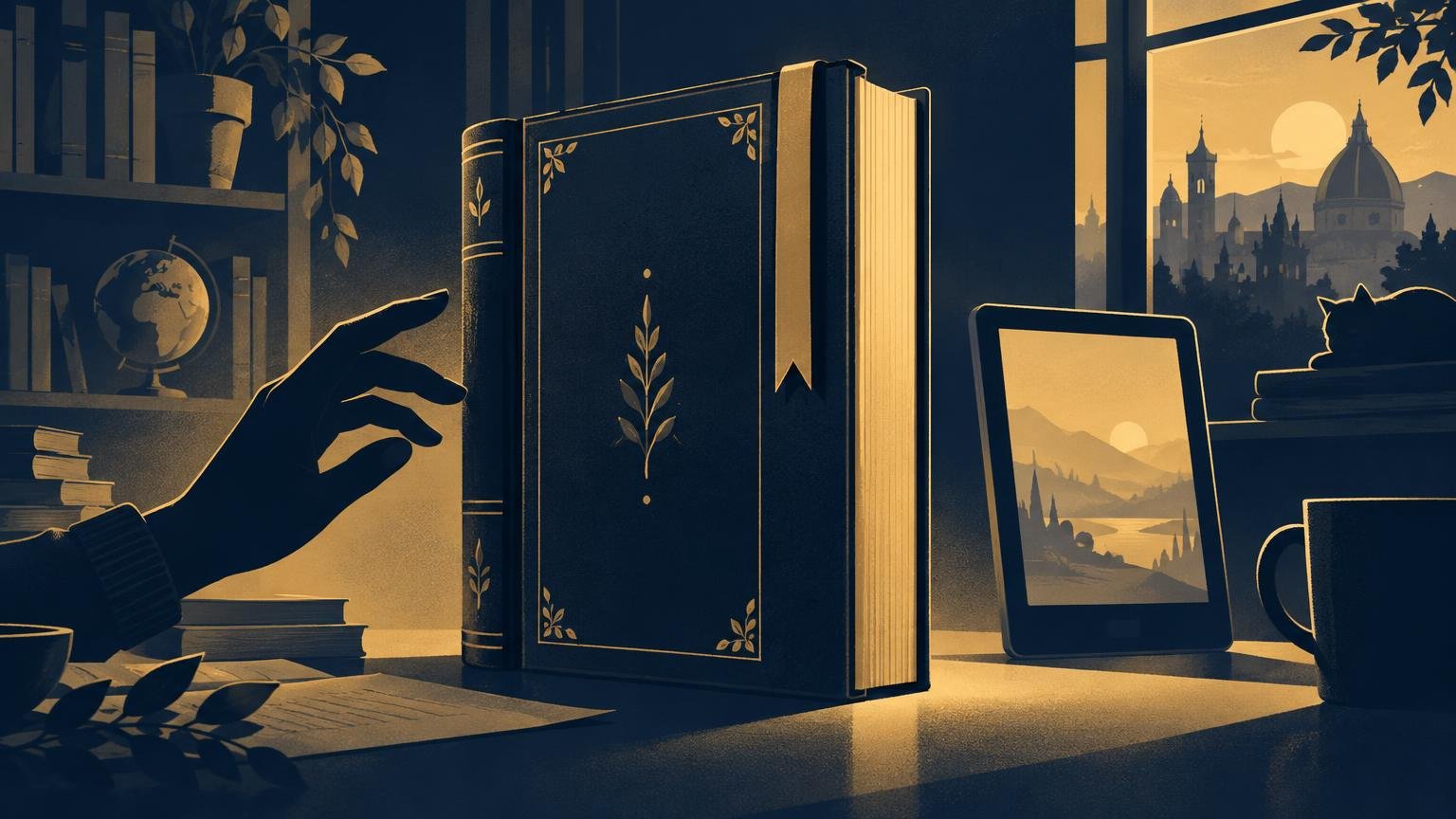
A luxury edition adds physical presence. It can give a text weight, texture, scale, craftsmanship and a fixed visual identity that an ebook can represent on a screen but cannot materially possess. The story may be identical, yet the encounter with it is not.
That does not make the luxury edition the better reading format in every situation. An ebook may be more portable, adjustable and accessible. The real question is whether the physical edition’s interpretation of the book matters enough to you to justify its price, space and care.
The book becomes an object, not just a container
Every format shapes reading. An ebook frames the text through a device, reading application and settings chosen partly by the reader. A luxury edition makes many of those decisions permanent: the dimensions of the page, the texture of the paper, the proportions of the margins, the typography and the sequence of illustrations.
Those choices can change the reader’s pace. A large page can make a poem feel spacious. Thick paper can make each turn deliberate. An illustration placed opposite a particular passage can create an association that persists on later rereads. None of this rewrites the text, but it can direct attention much as performance, lighting and music direct attention in a stage production.
Consider The Folio Society’s limited edition of The Waste Land. It uses vellum with gold blocking, letterpress printing on mould-made paper, hand-tipped colour plates, hand binding and a cloth-covered clamshell box. Its 11 plates and chosen Walbaum type make the edition a specific visual interpretation of the poem rather than a neutral delivery system.
An ebook can reproduce images and typographic ideas, sometimes beautifully. It cannot reproduce the resistance of a page, the depth of letterpress printing or the physical relationship between an illustration, a sheet of paper and the reader’s hands.
Luxury design can become part of the interpretation
The most persuasive luxury editions do more than decorate a familiar book. Their materials and visual decisions respond to the work’s mood, period, structure or central images. The binding, type and artwork become arguments about how the text should feel.
That is also where an expensive edition can fail. Fine materials do not automatically produce a meaningful interpretation. A book covered in elaborate ornament may still feel disconnected from the writing. Luxury is most valuable when the design reveals something, intensifies something or gives the reader a new way to notice what was already there.
This resembles the question we ask when a story changes mediums: not simply what has been preserved, but what the new form makes possible. A luxury edition remains a book, yet its material design can function almost like an adaptation layered around the original words.
Scarcity gives the copy a history
A standard ebook is designed to deliver the same file to many readers. A limited physical edition can make the individual copy significant through numbering, signatures, handwork and evidence of its production.
The cited edition of The Waste Land was limited to 350 hand-numbered copies, with its limitation page signed by illustrator Tom Phillips. The Folio Society listed it at $1,500. The number and signature do not change the poem, and neither the price nor scarcity guarantees future resale value. What they change is the reader’s relationship to this particular copy.
That distinction matters to collectors. The object has a place in a finite edition and can gather its own history through ownership, condition and use. Readers drawn to that broader object-centred way of thinking may also appreciate Kraken Opus’s coverage of games and collecting.
A physical edition can age with its reader
An ebook can preserve annotations and reading progress within a digital system. A physical book records time differently. Its spine loosens. Pages acquire small marks. A ticket, note or pressed leaf may remain where a reader left it. These changes are not always desirable to a collector, but they can make a personal copy inseparable from the circumstances in which it was read.
Physicality also brings responsibility. The Library of Congress explains that hard bindings protect books and resist wear, but books remain vulnerable to light, water, pests, environmental conditions and handling. A luxury edition is therefore both durable object and fragile possession. It may demand more care precisely because its materials matter.
What the ebook does better
The comparison becomes misleading if physical sensation is treated as the only meaningful kind of reading experience. Ebooks can give readers control that a fixed printed page cannot.
The World Intellectual Property Organization’s accessible ebook guidelines describe properly prepared ebooks that support changes to text size, typeface, spacing, contrast and colour. They can also work with synthetic speech, braille displays, switches, gestures and eye-tracking systems. These capabilities can make digital text not merely convenient but essential.
Accessibility is not automatic. It depends on how the source document was prepared, how a retailer processed it, the reading system and the supporting technology; some systems may not expose features such as image descriptions. Even with that qualification, an ebook’s adaptability remains a major advantage over a page whose type, contrast and dimensions cannot change.
| Luxury physical edition | Ebook |
|---|---|
| Fixed materials, scale and typography | Reader-adjustable display on supported systems |
| Tactile evidence of binding and printing | Portable access through a compatible device |
| Numbering, signatures and handwork can distinguish a copy | The same digital edition can be distributed broadly |
| Can accumulate visible signs of ownership and age | Can preserve digital notes and reading settings |
| Requires storage and protection from physical damage | Depends on software, hardware and file preparation |
When the luxury edition is worth choosing
Choose the luxury edition when the edition itself offers an interpretation you want to live with. Look beyond price and ask whether the paper, illustrations, binding and typography respond intelligently to the work. Scarcity is a thin reason to buy if the design leaves you cold.
Choose the ebook when adjustable presentation, portability or assistive technology will make the book easier to read. It is also reasonable to read digitally and keep a physical edition as an art object or rereading copy. The formats do not have to compete for the same role.
What a luxury edition adds is not a better story. It adds a body to the story: one particular arrangement of paper, image, type and craft that cannot be separated from the copy in front of you. An ebook offers freedom from many of those fixed decisions. A luxury book makes those decisions the point.